Have you ever needed to use a simple poster mockup? No need to go hunting for one on the internet. Just make a poster mockup yourself!
Open up your favorite photo editor, and off we go!
I happen to use GIMP. It’s free, and it has great easy to use features that meet the vast majority of my needs.
If you’re interested in downloading GIMP, you can do it right here!
Here’s a quick tutorial on GIMP for how to make a quick and easy poster mockup!
Let’s make a poster mockup!
First, open up GIMP. It will bring you to a blank screen.
Opening our Layers
Then open up your file explorer and find the background you want.

Drag and drop it straight into the GIMP window, and it will open your background up for you.
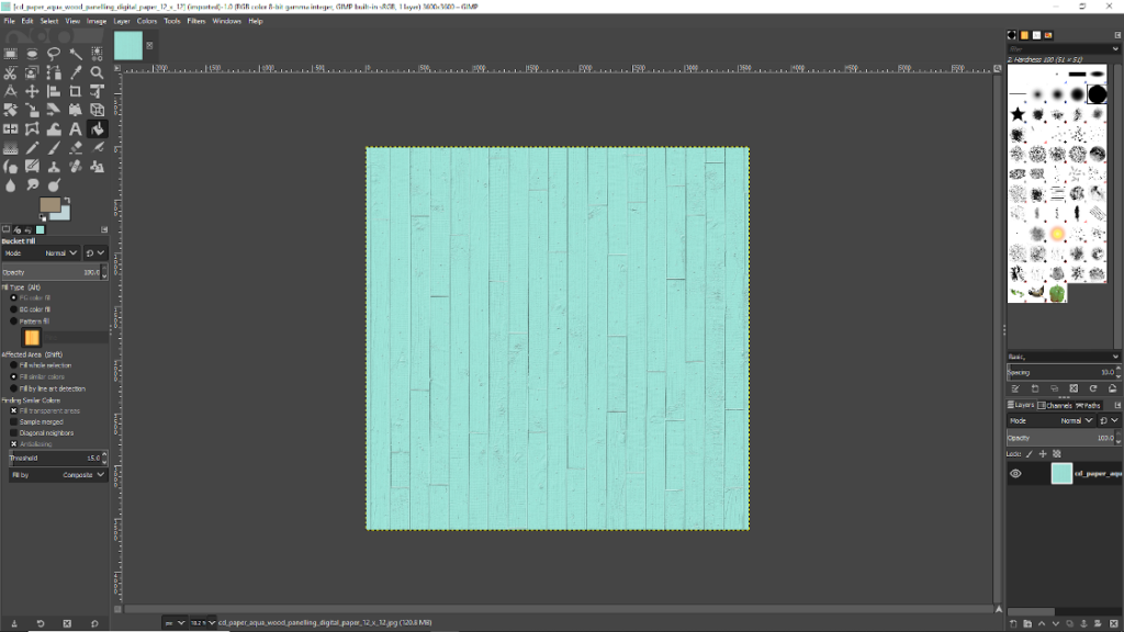
If you don’t have a pre-made background you’d like to use, then you can just open up a new layer, by going to File -> New, then fill in the size image you want.
It will automatically choose what to fill your new image with unless you head down to Advanced Options and choose something different there
After you click OK, you can go choose a new color in the left toolbox and use Bucket Fill to add it to your layer.
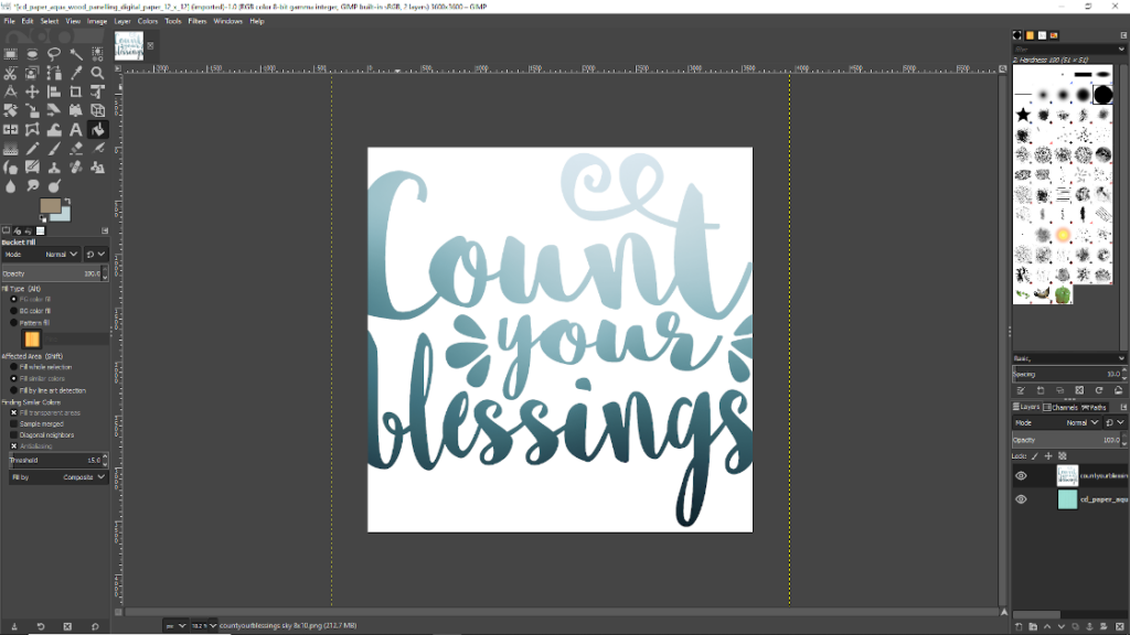
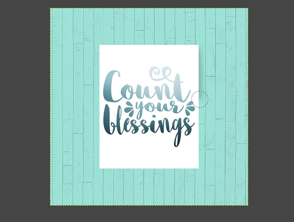
Next, we’re going to go get our image that we’d like to put on our mockup.
Open up your File Explorer again, and go find your image.
Then, just like your background, drag and drop your image onto somewhere in the middle of your GIMP window.
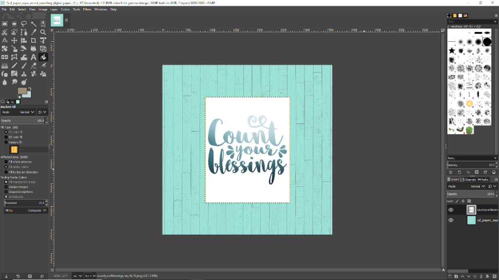
It will overlay your image on top of the background image you have on the screen.
Resize, if necessary
In my case, the Count Your Blessings image I chose is far bigger than the background image I had set up, so it looks weird.
In your case, the background image may be too big for your desired poster size.
In either case, we want to shrink the bigger image, instead of enlarging the smaller image.
If we enlarged the smaller image, like if I enlarged my background, it would make the background really fuzzy and pixelated, and we don’t want that!
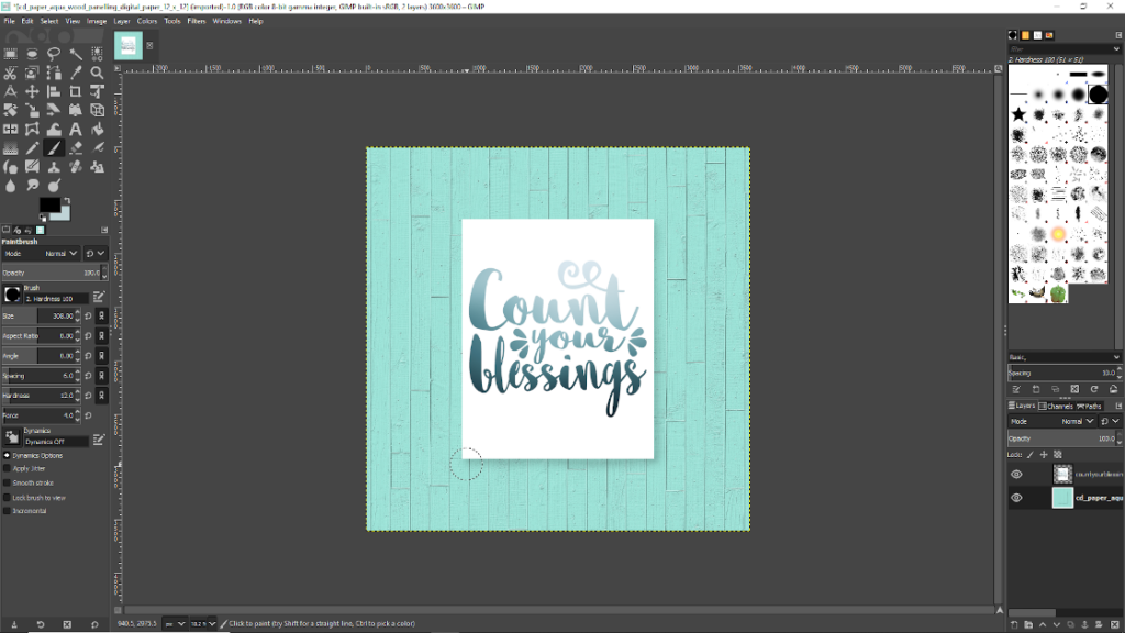
Down in the bottom right corner, you’ll see a “layers” window.
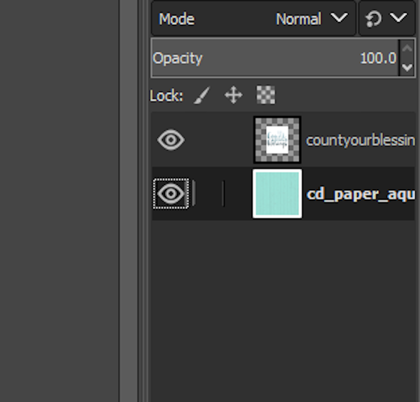
Make sure the layer you want to change the size of is selected. When it is selected, it will look like a dark highlight.
Above, my background image is highlighted, so I’ll want to select my Count Your Blessings layer before I attempt to change its size.
Once you have your desired layer selected, head on up to the top of your screen, and find the “Layer” drop-down menu.
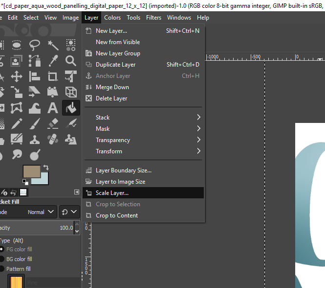
Choose “Scale Layer”. This new window will help you change the size of your chosen layer.
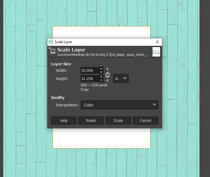
When you first open the window, the units of measure is likely to be in pixels.
I changed it to inches, because I have a lot easier time visualizing that unit of measure, and because I don’t need my image to be precise.
Being rather lazy myself, I guessed and checked the sizing changes.
The Count Your Blessings layer started out at something like 50 inches wide, so I shrunk it down to 10 inches wide, just to see what happened.
It ended up being too small, so I guessed again at 25 inches wide, and that was perfect for me!
Draw a shadow!
Now, we’re going to head back down to that Layers window, and make sure your Background layer is selected.
Because, all we’re going to do now is draw a little shadow on the edges of the Count Your Blessings layer, and then we’ll be done!
Go over to the left side of your screen, and find the Paintbrush tool.
Don’t be tempted to just use the Pencil tool, because it doesn’t have one of the settings we need to tweak.
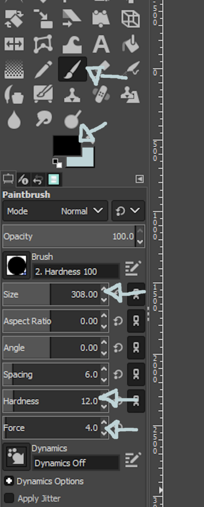
The top arrow here shows the paintbrush tool.
The second arrow shows the color that your paintbrush is going to draw.
Straight black works great, but if you want to use a dark gray for an even more subtle effect, you definitely can.
This third arrow shows the size of your brush. This also takes a bit of guess and check. About 300 was the right size for me. Refer to my “in progress” image below to see how the size I chose looks compared to the size of the image.
The next two arrows are what makes the shadowy part. You want them both to be very low. Hardness under 25, and Force somewhere around 4 or 5. Of course, you can tweak these to get the effect you want.
Make a poster mockup look more realistic with a shadow!
I like to place my shadows down the right side and the bottom, like this:
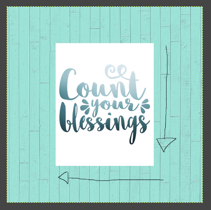
To me, it just seems like the most natural places to put them.
So, we’re going to get our paintbrush, again making sure we have our Background layer selected, and draw with the middle of the paintbrush right down the edge of our Count your Blessings layer.
You can see how the top Count Your Blessings layer is unaffected by the paintbrush.
By having the paintbrush go along the edge, it puts the darkest part of the paintbrush right where you would expect the darkest part of a real shadow to be.
And, here’s what it looks like when you’ve drawn your shadow all the way around the edge!
I think that looks pretty good for something that only takes about two minutes to make!
Really, the first time through takes a little bit of guess and check, but once you know how you like things, this is a pretty quick process!
Isn’t it amazing what just the addition of a little shadow effect does?

How to save your poster mockup
To save your new mockup, you’ll need to use the “Export As” option under the File dropdown menu, instead of the “Save as” option.
Using Export As will let you just type in what ever file type you want to save it as, like JPG or PNG. Whereas Save As will save it as a GIMP editable file.
I hope you liked this quick and easy tutorial on how to make a poster mockup!
Get the Free printable!
Like this simple Count Your Blessings printable?
Head on over to my shop and get if for free!
Have any other easy suggestions for making this awesomely simple mockup? Comment below!